This post addresses the very personal topic of dieting and weight management. I venture into this sensitive subject for a couple of reasons. Firstly, because I have benefited from the weight management experiences shared online by others it seems only right to “put myself out there” in the hope of helping others. My second reason is more selfish. I am posting this, in part, to hold myself accountable. I speculate that I may do a better job of weight management if I have to periodically publish updates.
A couple of previous posts describe my experience with The Hacker’s Diet by John Walker. My 2006 post explains why this method appeals to me and describes how I applied it to my situation. In my 2011 post I share some additional thoughts on the system and briefly discuss my failure in the maintenance phase. About five months ago I started using the diet again. This post describes my recent experience and compares it with my previous experience.
EatWatch log visualization and discussion
A central concept in The Hacker’s Diet is a fanciful EatWatch device that tells you when to eat and when to stop eating in order to maintain your desired weight.. The book describes the underlying principles of the EatWatch and provides you with the tools to “build” one for yourself. This section presents data from my EatWatch.
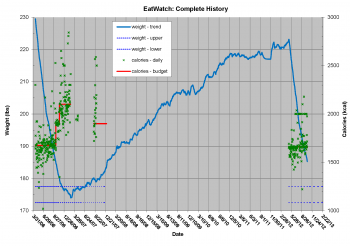
The chart shown in Figure 1 presents my entire EatWatch history – April 2006 until the present. As you can see, I am a dedicated researcher who felt compelled to repeat my 2006 weight loss experiment to verify the findings 🙂 Seriously, I am still trying to understand what went wrong after my initial success. I may examine that topic in another blog entry. This post simply presents the facts as recorded by my EatWatch.
The horizontal axis in Figure 1 is time from April 2006 through the present. The left vertical axis is weight in lbs, and the right vertical axis is dietary calories (i.e. kilogram calories) in kcal. The blue curve in Figure 1 is the smoothed weight values. The red line represents my calorie budget during diet periods. The green data points are daily calorie counts. The dashed blue lines in Figure 1 depict the target weight range (a 5 lb band centered on 175 lbs) that I intended to maintain.
My 2006 and 2012 diets are clearly indicated by the steep negative slope sections of the blue smoothed weight curve along with the green calorie count data points. You will note a third region of calorie count data points in September 2007 where I briefly attempted to reapply the diet as my weight deviated from the target band.Perhaps the most notable feature of Figure 1 is the extended period of steady weight gain from early 2007 through the end of 2010. This graphically illustrates my total failure to implement the weight maintenance principles described in the Perfect Weight Forever chapter of John Walker’s book. Analysis shows that I gained about 0.22 lbs/week during this period. That rate of weight gain equates to a surplus of 110 calories per day. To put that in perspective, that is an extra cookie OR banana OR 8oz glass of orange juice per day. The rate of weight gain tapers off for the last year or so to about 0.06 lbs/week or 30 extra calories per day.
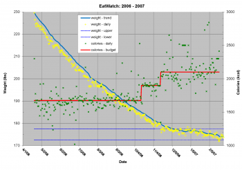
The chart shown in Figure 2 is an updated version of the EatWatch log presented in my 2006 post. Think of Figure 2 as “zooming in” on the left portion of Figure 1 with some additional data plotted. The yellow symbols are daily weight measurements. The blue line is the smoothed weight. The red line is my calorie budget. The green symbols represent daily calorie counts.
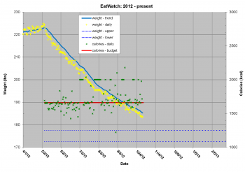
Adding the daily weight values (yellow symbols) to the chart illustrates the value of the smoothed weight curve. As described in the Signal and Noise chapter of John’s book, filtering or smoothing the daily readings from the bathroom scale is just about the only way to stay sane while dieting. My 2006 experience with The Hacker’s Diet was perfectly satisfactory. The EatWatch tools worked exactly as advertised, and the diet was tolerable.The chart shown in Figure 3 is my EatWatch log for 2012. Think of Figure 3 as “zooming in” on the extreme right portion of Figure 1 with some additional data plotted. As before, the yellow symbols are daily weight measurements. The blue line is the smoothed weight. The red line is my calorie budget. The green symbols represent daily calorie counts. You can see that the 2012 EatWatch history appears to be quite similar to my 2006 experience. We will examine that further in the next figure.
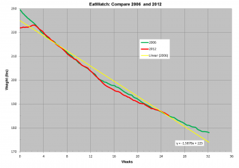
The chart shown in Figure 4 compares my 2006 and 2012 experiences. Weight is shown on the vertical axis while the horizontal axis depicts time in elapsed weeks. The green curve chats the smoothed weight values from my 2006 experiment, and the red curve shows 2012 smoothed weight values. These two weight loss experiments had slightly different starting weights (229.5 lbs and 223.1 lbs respectively), so the red curve has been shifted to the right by 16 days to enable direct comparison between the curves. In other words, the 2012 diet started 16 days later than the 2006 diet.I was pleasantly surprised and oddly reassured by the incredibly close correspondence between the 2006 and 2012 curves. I was completely confident that The Hacker’s Diet would work as it had before, but I never expected that the weight loss histories would agree so closely.

Figure 4 – SAE EatWatch log comparison between 2006 and 2012 [click on chart for a higher resolution version].
The yellow line in Figure 4 is a linear trend line (simple linear regression) fit to the 2006 smoothed weight data. The equation for this trend line is shown near the bottom of the figure. The slope (i.e. rate of weight loss) is approximately -1.6 lbs/wk. Comparing the smoothed weight curves with the linear trend line you can see my rate of weight loss was higher at the beginning of the diet than at the end. The knee of the curve (i.e. point where the slope changes) occurs right around 200 lbs for both the 2006 and 2012 data sets. I believe this change in the rate of weight loss can be explained by the fact that your metabolic rate is a function of your weight – the heavier you are the more calories you need to maintain a constant weight. Yes, it is a sad irony that the process of losing weight makes it harder to keep losing weight!
Differences between 2006 and 2012
As indicated by Figure 4, my 2012 experience is very similar to my 2006 experience. There are, however, a few differences this time around. The primary difference is that technology has provided me with better tools that make calorie counting noticeably easier. In 2006, I used a Palm PDA application to keep track of my calories. The Palm app “remembered” my previous entries, but it did not come with a pre-populated database. I had to use external references to estimate calories for various foods. I did this with an FDA database Palm app and numerous nutrition information PDF documents for restaurants that I frequented. This method worked surprisingly well, but it was pretty labor intensive.
The 2012 version of my EatWatch uses an Android smartphone instead of the Palm PDA. Rather than relying on the static databases and PDF references I carried on my PDA, the smartphone can readily access all of the nutrition information available on the Internet. Calorie checks can be accomplished via standard web searches or one can use a calorie counting app with associated databases and a search function. Even better, the apps also feature the ability to scan product UPC symbols (i.e. bar codes) for incredibly convenient calorie check and data entry.


Good for you Shawn and thanks for sharing. I too am a geek dieter and use a web page/mobile app for tracking daily calorie requirements as well as calorie intake and spreadsheets for analyzing. Like you I too have noted that when I don’t continually track my caloric intake the weight trends upward. Unlike your method, I only weigh once a week, on the same day and at approximately the same time, before I have eaten anything in the morning. This works well for me as a smoothing function. I also take and track several body measurements at that time as well.
If you haven’t done this already, you have a good set of data to estimate your daily metabolic rate change versus age assuming your activity levels have been somewhat consistent for the two periods. In Fig 4., there is an 8 week window where those loss curves are identical and you could probably use the 21 week window since the weight values match at the ends. I’ve read for adults that the base metabolic rate drops about 4 calories per year. I’d be interested in your findings. Just another factor working against effective weight maintenance.
Pingback: The Hacker’s Diet – Update | Shawn Engelland
Pingback: The Hacker’s Diet – May 2013 | Shawn Engelland